Monday, 20 May 2013

You can't always stick a light where you want it... So cheat in Photoshop.


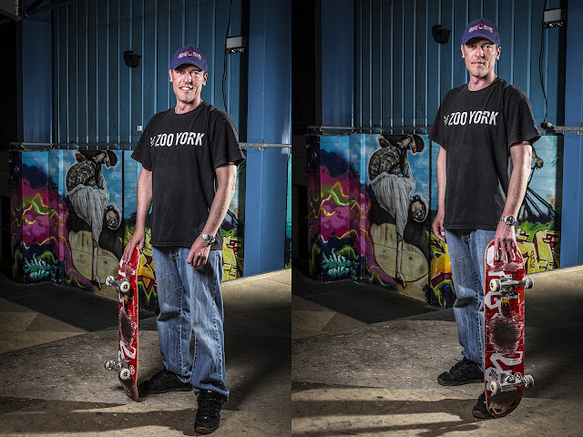
There are times you'd like to place a flash-head to light an area, but there's no way you can. My recent "No Rest For Old Skateboarders" post actually bears this out, I really wanted to light the graffiti on the back wall behind the skaters, but that would have meant placing a light in the middle of a very busy skatepark, the chance of the flash-head getting knocked over was very high. There is a way around this using Photoshop.


I saw this technique a year or so ago, Glyn Dewis had posted a how too video on YouTube, the video is at the foot of this post, in Photoshop simply using a soft paint brush tool on an additional layer and then changing the designation of the layer to 'overlay' and fiddling about with the opacity percentage to get the your desired effect.


Okay I went a little OTT here on the hair eyes and beard, but honestly it works, though I'm expecting a knock on the door from the Photoshop police at any moment.


Once you've set the layer to overlay it all calms down a lot and give the areas painted over  a much lighter effect. A bit too much in this case, so I played with the opacity slider and dropped it to about 50%, that worked for me, enough lightening to make it look like I'd placed a light actually on the ramp behind the skater. 


Sorted!


Above: Before shot, three flash-heads...


Three flash-heads and a drop of paint in Photoshop...

All images ©2013 Alistair Kerr Photography

Sunday, 5 May 2013

No Rest For Old Skateboarders


On the first Saturday of any given month it's Middle Age Shred session at Deeside Evolution Extreme Skatepark. Your older skaters are in attendance, practicing new tricks, trying to get tricks back which they've lost over the years, meeting up with friends, recapturing their youth, but above all having fun, because that's what skateboarding is about.

So in-between grinding the coping, flipping onto a rail, or picking themselves up after a wipeout, they came and posed for the camera. These people could work with you, or you might see them walking to work in a suit, they might be building your extension on your house, god help you if they are your pilot for your next trip abroad. Now you know that in their spare time they take their boards and shred.


Oh yeah, you know the saying, "There's always one" well in this case there's two!


This is Dean Sanders, he skates hard, constantly looking for new lines in a bowl to pull off a trick, to make that trick just that little bit more ridiculously hard to do. These shots show the attempt at flying up off a hip in a bowl and landing, and sliding a smith grind up on the vertical extension, he was so close to making it, next time.

Friday, 3 May 2013

Apple Boxes - First Pre-Production Samples

So here are the first samples of Apple Boxes that a client of mine has produced, usually building bespoke kitchens and furniture, they saw my Apple Boxes and decided to build some. These are preproduction samples, having your company name/logo cut into the side panels of the boxes will be an option


Wednesday, 1 May 2013

Reworking some old Mountain Bike Downhill Race shots


I've been revisiting-reworking a few old images, popping them through Lightroom 4 to see what the software will let me get away with. These were taken back in 2006, I was using a Canon D60, state of the art 6megapixel DSLR camera, at least it was back then. The images always needed contrast and saturation adding to make them pop off the screen in post.


Above 2006 - Below 2013


Lightroom has let me tweak the original jpeg (I can't find the original raw), it's pushing it, the noise is increasing, but for an 18Mb original it's come out okay. Pops more than in 2006 that's for sure.


A couple more images that have had a tap with the 2013 Lightroom 4 stick, yes I've been playing with graduations, in the root system under the bike, originally there was a bit to much light from the flash I used to backlight the riders. Seven years late... Corrected.